
white balance
adjective
in photography:
the global adjustment of the intensities of the colors (typically red, green, and blue primary colors).

During my last shoot, the topic of “white balance” came up, so I decided to elaborate on the subject in this week’s blog.
Why is it important to know in photography? Well, you know that “WB” button on your camera? That’s referring to your white balance. And your white balance will determine if your images come out warm (yellow temperature), or cool (blue temperature).
Although our eyes are good at judging what is white under different light sources, our cameras have the tendency to create a different color cast when setting the white balance in “Auto White Balance” (AWB).
I briefly talked about it in Reina en Rojo Pt3: Color Tones: To understand white balance, I’ll have to explain a little about color temperature.
Color temperature is measured in units of Kelvin (K) – this will help when choosing the light bulbs for your shoot (and your light bulbs at home too!)

So how do you obtain white balance? Instead of appearing blue or orange, the whites on your images should appear white after correctly white balancing them.
Indoors – Next time you’re in a room, take a look at the lighting; Depending on the lighting, you should set your camera to that temperature. For example (look at the far left section of the graph), if the room is lit by common household tungsten bulbs, the color temperature is at about 2700K – set your camera at that Kelvin.


I used two different color temperature light bulbs for this shoot. Take a look at the backdrop. You’ll see a yellowish tone on the left, and a blueish tone on the right – white balance on both images was set at AWB.
Outdoors – Now take a look at the middle section of the graph on the right. Set your white balance depending on the time of day, or if its cloudy or sunny.

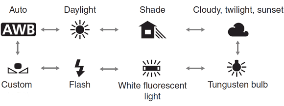
White balance may seem a bit trickier than what it really is. All it takes is a bit of practice. I suggest you screen shot the chart above, and use it as a cheat sheet. I’m also including a picture of how your WB display balance looks like so you can match them both.
I am always here to answer any questions, so please feel free to comment below – and as always, I would love to see what you create. Please leave a comment with the link where I can follow your work.
Click on the image to view full size


